

We finally have a No Time To Die poster, which to me was very much expected because this is to me the first piece of Bond 25 collectable I'll probably get. While a trailer is much more enjoyable in terms of fun, a poster feels like something you can actually touch and display in your room. It's the first introduction of the new Bond movie into that little "Bond Museum" many of us have.
Unfortunately, I don't find this poster very attractive and I'm afraid that all of the others felt like Rembrandt and Monets in comparison to this one. You can take a closer look at the full No Time To Die teaser poster here.
Now I'll go in full with my thoughts. There are three primary things that put me off:
Daniel Craig's facial expression. In the posters for the previous four films of the Craig era, he always looked determined. Sometimes he looked a bit "depressed" (Skyfall), sometimes confident (Casino Royale, Quantum of Solace) and other times a bit stone-faced (SPECTRE). Here, he looks uninterested. As if instead of James Bond I'm looking to an actor being spotted by the paparazzis who took him a candid picture. He looks extremely causal. I wouldn't have minded if this was a still for a magazine, but it doesn't works as a poster. Had I been the photographer or the man in charge of the session, I would have discarded this pic right away and asked Craig to change his expression, to look more serious and intrigued.
Unarmed Bond. In every James Bond teaser poster, in the international ones or those made for the primary market at least, 007 bragged about his licence to kill by posing with his trusty Walther PPK or any other gun. Either proudly showing it or just walking by with it, but the gun was always evidenced in a way or another because we had to see this elegant man was also a man of danger. I hope the exclussion of a gun has nothing to do with some sort of "anti gun" measure because that would be completely ridiculous. Guns have been a part of Bond's ADN since the dust jackets of Ian Fleming's books designed by Richard Chopping.
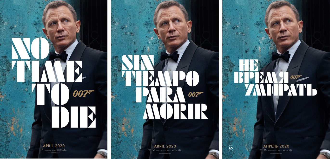
The HUGE logo. Was that really necessary? The Futura Black has been growing on me lately and I like the retro look it has. However, it was just foolish to make the logo that huge. In the US poster it covers Bond's figure so much that really puts me off. It just feels tacky. Fortunately, the foreign versions have reduced the size of it considerably and makes the overall poster look acceptable. Take a look at the comparison below. The US poster, the Latin American one (the one I'll get) and the Russian one. The one I love the most is, by far, the Russian. Because it lets the image breathe. Fortunately "my" poster has the logo much smaller than the original version but it still "eats" much of the frame.
I do like the turquoise background, but I would have changed most of the things. Let's see if a Quad version for the UK drops anytime soon and if that can make me like the art a little more.
Other than that, I'm sad there aren't really good posters anymore for Bond. The Casino Royale ones were fantastic, and I liked some of the Quantum of Solace and SPECTRE ones (mainly the most "colorful" of them, as the blue sky one sheet of the former and the white tux version of the later) but I feel all of the theatrical posters for the Craig era were actually "teasers" instead of theatricals. I would hope to see a very inclusive theatrical poster for No Time To Die: Bond, girls, villains and an explosive coctel as the ones from the Brosnan days. I want someone to sell me an action blockbuster! A thrilling ride from the beginning to the end! But I doubt it...
To paraphrase James Bond in GoldenEye: "That's the trouble with the world today. No-one takes the time to do a really creative poster anymore. It's a lost art!"
Anyway, as I anticipated, I'll try to get this one. After all, one doesn't stop being a collector and I want to welcome the film among the Bond brotherhood. Mind you, the GoldenEye poster may be constantly bullying him – and I may turn a blind eye on that bullying! Hehehe...
No hay comentarios:
Publicar un comentario